Spotlight: Julian Montague
Features: New Work by Julian Montague
Opening December 3, 6-9pm
BT&C Gallery, 1250 Niagara Street, Buffalo
Amid/In Western New York, Part 5
Through December 19
Hallwalls, 341 Delaware Avenue
Tell us about the new work at Hallwalls’s Amid/In exhibit and your solo show at BT&C Gallery.
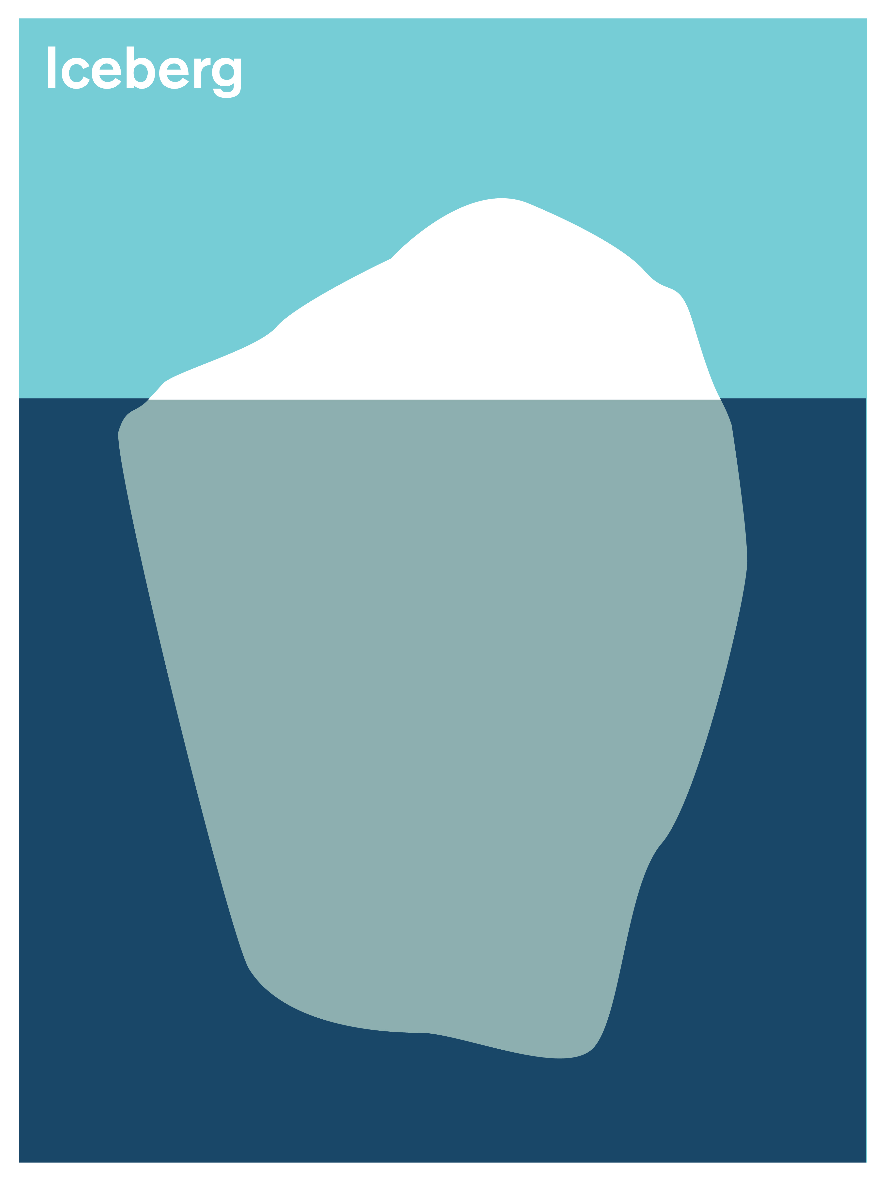
The work at BT&C and Hallwalls is a new series of paintings in which I depict features of the landscape;, they are mostly geological features and events. I’m very interested in thinking about geological time, and the way the physical world around us was formed. In the pieces I isolate a feature and depict it in a very simple, clean way. In the upper left hand corner there is a word or phrase that acts as a label. Some of these words are specific, perhaps less familiar terms (glacial erratic, cuesta, drumlin), others are more familiar and almost too general (island, shore, horizon). I’m hoping that in their stillness and simplicity they relate some feeling of the slow, unending processes of the earth. I’m also interested in the way that language and naming relate to the way that we see things. This is a big part of my other projects. The difference between the broad and specific terms in the pieces is a way of suggesting that language can maybe only take you so far in the effort to understand reality. But also, I just like playing with how words interact with images. Part of the inspiration for this work comes from a childhood interest in Japanese ukiyo-e prints. In that genre there are a lot of landscapes depicted with clean, hard lines and descriptive text or poems. Prints made in the vertically oriented oban format like Hiroshige’s 100 Famous Views of Edo are a connection point for me.
How does it connect to your past work?
This is a bit of a departure in terms of medium and approach, although these pieces do bear a superficial resemblance to my more commercial print series. The two big multi-year projects (The Stray Shopping Cart Identification Project and Secondary Occupants/Animals & Architecture) both have fictional authors at their center and a fairly complicated conceptual conceit. This work is seemingly more straightforward. What it shares with my other work is that it addresses and investigates things that can be found in the real world. In general I want to take something that people are familiar with (stray shopping carts, spiders, birds, etc.) and offer a new way of seeing it. I’m not interested in making work that mainly derives it’s meaning through its relationship to other art or the medium in which it’s made.
We’ve seen numerous examples of your distinctive posters for events around Buffalo for years. You also create book covers, record jackets, logos, and a whole range of graphic design with a very disciplined approach. You’re a prolific commercial artist, but at the same time you’re a fine artist with work that can simultaneously appear deceptively simple yet highly conceptual. Please share your perspective on these two sides of your work and their relationship.
The relationship between my design and art work can get a bit confusing as I often use the tools and techniques of graphic design in my art. There are academic debates over what is and isn’t art/design but for me it is pretty simple: If my work is in the service of the ideas/needs of a client, it is graphic design; if it is in the service of my own ideas, it’s art (with graphic design in it). One of my projects involves designing fake book covers that are the reading materials of a fictional character. The process of making the fake book is completely different from designing a cover for a client. Sometimes with the fake I will have the idea for the image first and then write the title. Obviously that would never happen in a designer/client situation. There is a slight gray area in that I do have print series (published by PrintCollection.com) that are not part of my official art practice and are aimed more at a design/homewares kind of market. But in that case Print Collection takes the client role.

Iceberg by Juilan Montague
Are there artists who influenced you in your formative years?
There were a lot of influences, but looking back there was one show at the Albright-Knox in 1990 (when I was 17) that really stuck with me and influenced my approach to art making. The exhibit was British artist Hamish Fulton’s Selected Walks 1969-1989. He recorded long hikes (the act of taking the walk was the art) with photographs and brief bits of text. There was a lot of large Helvetica in red and black on the walls as part of the installation. Another big influence were Brian Eno’s albums from the 1970s, in particular Before and After Science, Another Green World, and the Ambient series. Even though this is a non-visual influence, there is something in the tone of those albums that I connect to and want to, in some way, recreate in my work. Those Eno albums are all over the Features paintings.
What about your contemporaries today?
It’s kind of rare for me to find an artist that I really think is amazing. There are times when I go to the Chelsea galleries in New York City and almost everything leaves me cold. But there are a bunch of artists who I think are great. I’m usually drawn to artists who build a whole world with their work—David Altmejd, Olafur Eliasson, Sarah Sze, Tomas Saraceno, Geoff McFetridge, Mark Dion, and Nina Katchadourian are good examples of that.
Were you into art from an early age?
Yes. My father taught art history, design history, and drawing at the college level, so I was always exposed to art. I also went to the Buffalo Academy of the Visual and Performing Arts for high school. I didn’t study art or design in college; it wasn’t until I left school that I realized what I wanted to do. There were elements of what I do now in my work as a kid. I was always trying to make hard line graphics with flat, solid colors. I had almost no interest in proper drawing or rendering things realistically. I still don’t and I’m not very skilled in that way. This is somewhat ironic as my father, John Montague, is the author of an instructional book on perspective drawing that has been in print since 1984 and has been translated into a dozen languages.
What do you think about the art scene in Buffalo?
I think the scene here is great and I’m proud to be a part of it. The art community is strong and supportive with good institutions. Buffalo is a good place to live as an artist, but we do have a long way to go in developing a population that actively buys art.

